Awesome Changes in WordPress 3.5, Photographers Will Want To Know About
WordPress 3.5 is just around the corner, and there are some hot new changes that will be beneficial for photographers. They’ve talked about a new Media Uploader as one of the new features, so I’ve been stalking the Betas as they’ve been released to see what improvements they’ve been making. Last week the third Beta came out I thought I’d give a sneak preview of my findings and thoughts on the new direction they’ve taken.
Current Problems
Currently WordPress isn’t designed to handle lots of images. Your typical blogger uses 3-5 images in a blog post at most for a 400-800 word blog post. Professional Photographers on the other hand often use 20 or more; I know some crazy photographers that have put 100 or more photos in a blog post even! Inserting all those photos is a P.I.A. using the current uploader. Sure there are tricks like using the Gallery Shortcode, but using the Shortcode is like ordering off the Secret Menu at In & Out Burger; there’s some great stuff on it (can you say Double Double Animal Style?), but maybe 20% of the people know about it. And in the case of the Gallery Shortcode options, maybe even less.
I think the guys at WordPress finally figured that they needed to beef up the ability to handle more images than they were used to. It really shows in this latest Beta. Let’s take a look…
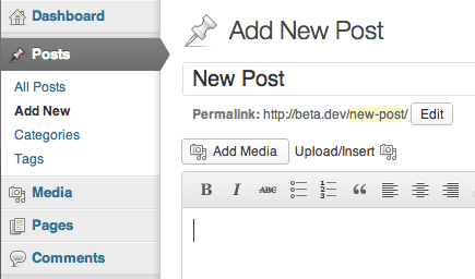
 In the Beta they have both the new way and the old way to insert Photos and other Media. By selecting the Add Media button, you get the new version.
I’m not sure what the plans are for the final release, but I would imagine that they would eliminate the old uploader. There will undoubtedly be upset people at first, but as they get used to the new system, I’m sure they will come to enjoy using it.
The New Dialog Box
As you can see, the new Insert Media is redesigned quite a bit. They’ve moved the “Upload Files,” Media Library,” and “Embed From URL” options to a new left column, and increased the size of the dialog box to be full screen. This helps display more thumbnails, larger when adding photos or looking through the Media Library.

The Media Library Option
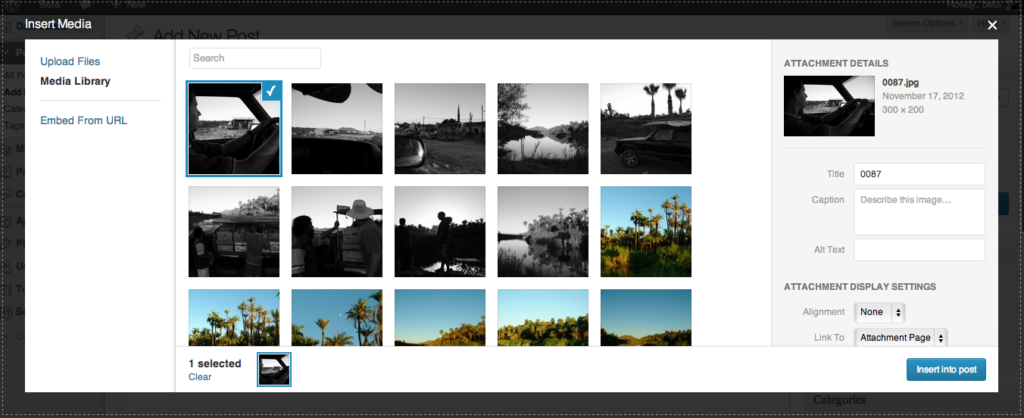
Selecting photos from the Media Library is much easier than before. Before the thumbnails were small, you couldn’t see the meta information without clicking the image and waiting for its properties to drop down, and you only had the ability to see 10 photos at a time.
In the new system the thumbnails are much larger, and… they’ve added INFINITE SCROLL!!! WooHoo!
The column on the right gives you a preview of the photo selected, and the meta is displayed right there, making it easier to add or change Titles, Captions and Alt Text as well as a few other things.
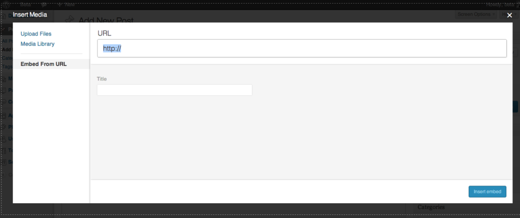
Embed From URL
While they’ve made many improvements to the Media Library, the Embed From URL option seems like it was just an after thought. It may not be a very frequently used option these days, but it still seems like they didn’t spend much time on it. It pretty much floats in a huge dialog box. They could’ve made the dialog box shrink to an appropriate size when selected to give a bit more polish and thought.

Inserting Photos
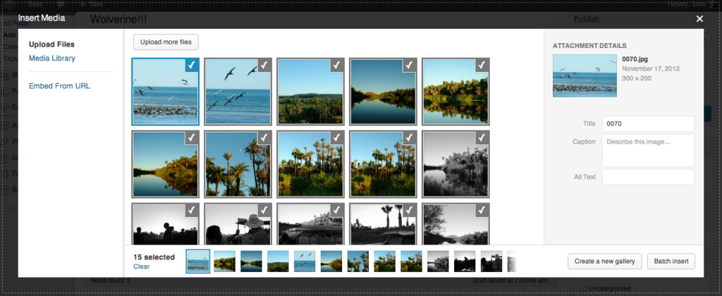
The process of inserting photos is much easier now. The dialog is very similar to the Media Library with its larger thumbnails and ability to scroll through all the photos you uploaded. Your information is displayed in the column on the right, and you now have the ability to Insert All Photos. This is a feature that’s been long overdue and has been tried by plugins (even we had a solution for awhile that did this). You can also create Galleries (if you’re not familiar with them check out how WordPress Galleries work).
Although WordPress has stated that it’s complete, there are a couple points that I think need to be modified before the public version:
- There is no Select All button. You can Clear All selections, but you can’t Select All yet. So if you insert 40 images and wanted to use them in a Gallery, and you accidentally Clear All, you have to select all 40 images one by one again.
- The smaller thumbnails below the thumbnail window is a bit redundant. It shows 12 images, whereas if it were eliminated, you’d have full view of 15 larger thumbnails.
- The left column with the Upload Files, Media Library and Embed From URL is pretty much wasted space at this point. It may be better to stick them across the top like before to pick up a little more real estate for the thumbnails.
Final Thoughts:
While this isn’t a professional solution (don’t worry, Flaunt Your Site is working on that), the changes that WordPress has made will be highly welcomed by the photographers that deal with high quantities of photos on a daily basis. While it still has some items that need to be addressed, I think that the new WordPress Media Uploader is a decent first attempt at a new method of getting your photos in your posts and pages.
OK, so when do we get it?
WordPress has the release scheduled for December 5th. So we’re just a couple short weeks away from being able to use it! Keep an eye out for that Update WordPress button, and happy photo uploading.


No comments yet.