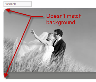
I’ve designed websites for awhile now. And one thing that’s always vexed me is getting rounded corners on JPEGs to look good. In the past I’ve used clipping masks in Photoshop, and having the background color of the Photoshop canvas match the background color of the website.  But the JPEG process always shifts the color of the background color and adds artifacts due to the compression process.
As you can see in the example image (taken from a quick design I did for The Unveiled) , the background color in this instance is a very light pale gray, but the triangular area where the image was clipped is a darker shade that clearly stands out.
The other problem comes when you want to change the background color of the site. If it’s visible now, what’s it going to look like when you change the background color to your favorite shade of Fuschia?
Transparent PNGs
Transparent PNGs came along and with the exception of Internet Explorer 6, 7, and 8, gave web designers the beautiful new ability to take graphics and apply different levels of opacity and transparencies.
The best use of this was applying drop shadows to graphics that appeared over multiple elements. Before this, you’d have to combine all elements into one graphic along with the shadow.
This new alpha transparency allowed great flexibility in design including creating shapes and corners that had transparency.
Perfect for what we want right??? Well…
The problem with Transparent PNGs is that they are HUGE. While they work very well for graphics like logos, and design elements that aren’t large file size wise to start, they are terrible for photographs. A 800×600 pixel photo saved as a PNG with alpha transparency is around 800k! Almost a full Megabyte. When the same size file as a JPEG is around 100k, it’s just not practical to save photos as PNGs.
So how does a brother get a decent rounded corner for his photos up in here???
CSS Border Radius to the Rescue!
London Wedding Photographer, Kat Forsyth brought up a question about adding rounded corners to her photos in a photo forum I belong to. I explained to her the options that she had, which equated to the long diatribe above.
But… on a hunch I tried applying the CSS “border-radius” rule to a photo. And it worked!
This as far as I know has never been tried, nor documented.
If you apply this to any image or image class, that image, or the whole image class will take on rounded corners!
border:1px solid #;
-webkit-border-radius: 20px;
-moz-border-radius: 20px;
border-radius: 20px;
Example
The images below belong to New York Wedding Photographer, Otto Shulze. He graciously let me use a couple images to demonstrate the CSS border radius trick. The image on the left is a standard image. The image on the right ad the highlighted code applied to it using inline CSS (that means I applied to it inside the HTML, not in the CSS file – it just made it easier to demonstrate this).


How to apply to blog images
The true power in this comes from the ability to apply the same radius to all your photos on your blog posts from one place! If you want all your photos to have a 15 pixel radius, you only need to change or add one CSS rule, and voila. They’re all changed instantly.
In your CSS file, add this rule somewhere you’ll remember it.
img{border:1px solid #;
-webkit-border-radius: 20px;
-moz-border-radius: 20px;
border-radius: 20px;
}
You can change “20px” to whatever looks good. Just remember to do it on each line as they relate to how different browsers read this rule.
If you use ProPhoto, or some other WordPress template that recommends that you not change the CSS file, they often have an area to add custom CSS. In that case you’ll add the same code in that area.
Another note, is that this rule will apply the rounded edges to all images. You can narrow it down by using “entry .img” or “post .img” or whatever your theme files are specifying for the images inside your blog posts. If you have questions or can’t figure it out, feel free to give us a shout and we’ll help you figure it out.
Find out more
This is just the tip of the iceberg when it comes to using CSS to enhance your photos all at once. You can have multiple radii, making tear-drop effects to your photos, have radii on individual corners and not others, etc. Then there’s things like CSS drop shadows and glows that, when used tastefully, can add something visually appealing to your site and blog posts.
Go check out W3 Schools information on CSS Borders for more on what you can do with these cool tricks.
Oh yeah…
This doesn’t work in Internet Explorer 8 and below, but as I tell everyone, “Internet Explorer can suck it.”

