Teresa Klostermann – Design Client Spotlight
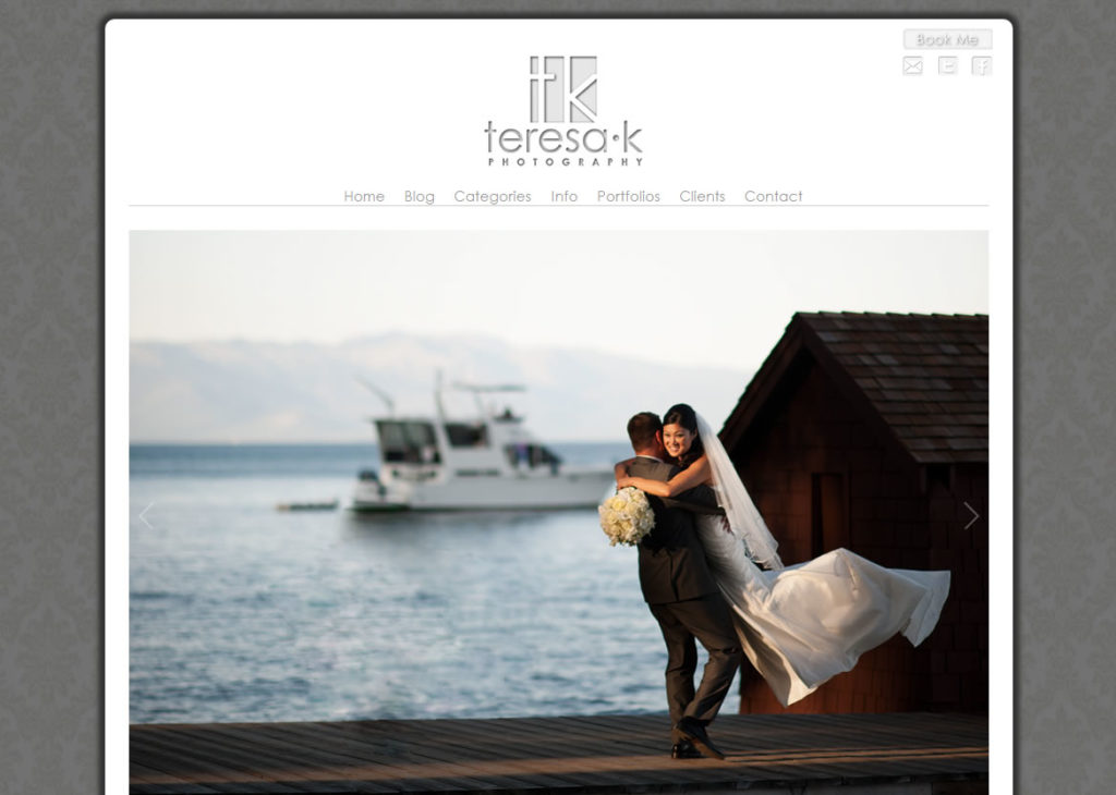
It’s always a thrill to create a new design for a client. Sacramento Wedding Photographer, Teresa Klostermann was no exception. She came to Flaunt Your Site with a few ideas in mind to give her site a makeover. It was close to what she wanted, but it was just lacking a little “curb appeal” so we did what they do on those makeover shows (well we didn’t film me sitting on my butt in front of my computer for a week playing in CSS). Based on the screen shot below I think it was a hit.
Teresa’s site started off with a very snow white WordPress theme that lacked visual depth. It was like a Mondrian painting. White on White. So the first step was to create some three dimensionality and give the site a certain pop. I started with a standard wedding pattern, but created an overlay to darken it. That would isolate the central area of the site and have people’s eyes drawn top the photos in the center.
We ditched her BluDomain site (which I highly recommend to anyone that uses BluDomain), and switched it out to a very iPad loving javascript portfolio. Now if one the 40 million iPad owners happen to be a bride in Sacramento, they’ll be able to look at Teresa’s wedding portfolio without a problem. We also added a few SEO goodies which should help her start to raise up in the ranks.
It was awesome to work with Teresa. She’s got a great passion for photography and it really shows. You should definitely go give her site some love.


No comments yet.