SEO Membership Login

Archive | January, 2012

An Open Letter to David Trust and PPA About SOPA

27 January

Dear David,

In light of your email to PPA members today about SOPA and PIPA, I’d like to speak to a couple of the things you addressed.  More specifically the actions that internet users were using “heavy-handed tactics” in order to spread “false information.” And what is being presented to the public as to what those bills would actually do.

Before any of that, I’d like to say that, I’m a photographer and I care about the protection of my images just as much as anyone. And I do believe that there is a solution out there to accomplish that protection. I completely disagree that that this was the way to do it.

So on to it…

The Internet is one of our sacred gems. It has no borders, we don’t need passports to visit our friends with tools like Skype, iChat, etc. And there is an innate freedom that exists there. For someone to restrict that freedom is something that will cause people to rise up against that threat.

Copyright is not, as you incorrectly attribute Google and Wikipedia with saying, censorship. But the practice of blocking of sites to viewers is.

Consider these scenarios:

  1. You’d like to visit someone’s house, but police prevent you from entering because there is a bomb in the house.
  2. You’d like to visit someone’s house, but police prevent you from entering because the person {may have} stolen something.  *Thanks to Nathan Johns @Austin_Photog for adding “may have” above since due process is diminished in these laws.

While the first scenario, authorities are protecting your interests (living and all that), the second is something on the lines of Marshall Law. Stripping the freedom from internet users is just that, stripping freedom.

To be clear there are countries that do restrict access, China, Burma, North Korea, Iran, Cuba, and a few more. I don’t think we want to end up in that list. It starts with blocking a few sites, but who decides what sites are Kosher, and what aren’t? It’s too much power for any one person, or group of people to possess when our freedom is on the line.

I’m fully supportive in a bill that actually targets the perpetrators. But this is something that must be fully thought out, and will involve working with other countries in order to achieve. The target should be the Copyright violators, and not the restriction of people’s internet access.

You should also note that the majority of photorgaphers I speak with, including rather heavy hitters in the industry, and many PPA members, have consciously opposed both SOPA and PIPA. This would point to a clear contradiction in how PPA represents member’s interests. They all understand that freedom is more important than ©.

Sincerely,

William Bay


Update:

Both Trey Ratcliff @treyratcliff and Scott Bourne @ScottBourne have come out and spoken against PPA’s support in SOPA and PIPA.

From Trey: “Infuriating! The Professional Photographers of America say crazy things in their latest email about SOPA!”
From Scott: “Sorry @OurPPA your positon in favor of #SOPA has just established you as utterly out of touch. You may be well intentioned but you’re wrong!”

Let PPA know how you feel.

PPA members can go here: http://www.ppa.com/articles/497/SOPA-and-PIPA-Dont-Be-Fooled.php and add your comments below David Trust’s letter letting him know that PPA does not have their members interest at heart in this case.

Also write to their Twitter account @OurPPA and let them know what you think.
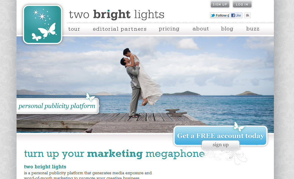
Two Bright Lights Partnership

25 January

I’m very pleased to announce that Two Bright Lights, have generously offered all Flaunt Your Site SEO clients a 20% discount on their services. It’s essentially 2 free months of Two Bright Lights.

If you’re not familiar with them, you totally should be. Two Bright Lights takes all the heavy work out of submitting to all the great blogs out there like Style Me Pretty, June Bug, Grey Likes, and all the other popular wedding blogs out there. In addition, they are constantly working to get other photo blogs in the mix, like maternity, baby, and lifestyles.

We all know that getting great links from editorial blog posts from high authority sites like these will skyrocket your sites in search rankings. That’s exactly why we created this partnership.

If you’re a current client, we’ll be delivering a coupon code, and for new clients the code will be in your SEO Action Plan.

3 SEO Things to Focus on in 2012 for Photographers

20 January

3 SEO things for photographers to focus on in 2012

Despite having a rather heavy first half of the month, I wanted to write up a post that would point to a few easy areas photographers could focus their efforts this year.

I’ll assume you already have the following handled:

  • Having an HTML based site that search engines can crawl, and plenty of good naturally written content.
  • A solid grasp of what keywords you’re seeking to rank for.
  • Healthy links that come from a variety of locations like blog comments, quality directories (not the paid or reciprocal ones), and most importantly editorial links from blog features and write ups.
  • Engagement through Facebook and Twitter.
You should have all those done already. The following is the next level and it will be a big focus in 2012.

1. Pinterest

2012 will be the Year of the Dragon according to the Chinese (I was born Year of the Dragon, so that’s good. I think…). But it most certainly will be the Year of Pinterest to the rest of us trying to promote our photography businesses.

The marketing adage is to go where your demographic goes. And you can’t get much better demographics for brides than 20-30 year old crafty hipster chics pinning away on Pinterest. They all like bowtie wearing men, and those mason jars that everyone seems to love.
All kidding aside the average Pinterest user is likely to be female and interested in unique designs and good photography. Not only should your website make it easy for people to pin your photos, you should have an account on there and be connected to all those hipster chics so they can see your latest and greatest photos.

Why else you should be using it:

How it will affect your SEO:
Directly it will affect your SEO by having a very powerful site linking back to yours with multiple
How to take advantage of Pinterest:
Well, if you haven’t, you should definitely use our Pin It On Pinterest WordPress plugin. It was the first plugin out there and it is by far the best. And the 1.0 version we’re planning to come out soon will be even better.
Get that plugin installed and let people start pinning your photos online. There already great sites out there that are receiving a huge amount of traffic from their content that has been pinned already.

2. Google +

OK, I’ll admit it. I waited awhile to adopt this one. Part of it was that I just didn’t want to hop on another hype without really seeing where it would go. Both Google’s Buzz and Wave were flops, and I had no interest in spending time on something that could have easily vanished.

As it turns out, Google + has become quite a hit, with features like group video chats and the ability to separate friends into unique circles so certain people can see certain things with greater ease than Facebook and Twitter. It looks like it has some great potential for the future as well. Not only is it getting the “thumbs up” from users, but it appears as if 2012 will see a big push for integrating Google + into your everyday search results.

Social Search

People with Google + profiles and business pages will become much easier for Google to vet. And websites that are tied to that profile will have a definite advantage. Connections  on Google+ will yield results on searches with your friends profile pictures on the search results making them stand out more.


You’re Circles of friends will be a huge endorser of your business by sharing your website on Google + and using the Plus 1 function on your website. Their friends will see that you are being endorsed by them, and you’ll have an instant recommendation.

Rel=Author

One of the cooler things that Google has rolled out is the Rel=Author tag. It’s still in the early stages and not everyone is able to see the benefits of it. But it’s intent is to have rich snippets show up next to blog posts and articles that you write based on your Google + profile picture.


Early Adoption is Key

These two features may not seem that big of a deal, but anytime you can get a little advantage in the SERPs, you should take it. If you were in the #3 position, you could potentially get more clicks to your site over the #1 position, simply by having that Rel=Author tag applied. Just imagine what that will do for your longtail traffic searches. You’ll definitely have a leg up on your competitors if you implement this early on. Eventually all the themes will catch on, and add these features, so it’s best to be leading the pack and get in quick.

3. Local Search

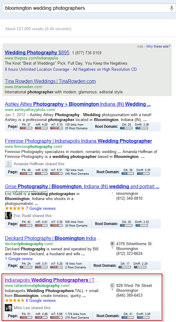
Local Search isn’t new, but the prominence of Local will increase. We’ve seen a few variations of how search results have been displayed, but where things seem to be settling lately is the Universal Search Result, which displays a mix of Local and Organic results. You can see in the screen grab below how the organic and Local results are co-mingling together.

The first 2 results are organic, but the next 3, including one of our clients Tall and Small Photography from Bloomington, are for their Google Places listings.


Optimize for local and organic

Things that you would normally do for organic are very important, but there are a few things that will improve the likelyhood that you will make it into the local results as well.

  • Reviews! Make sure that you are getting reviews on your Google Place page, Yelp!, Wedding Wire, etc.
  • Citations. The more evidence that you are a legitimate business the more evidence Google has to promote you as a fully vetted business. Flaunt Your Site has a solution to speed up the process of obtaining the necessary citations. See our Local SEO section for more information and contact us to get set up.
  • Ensure that you fill out your Google Places page completely, upload photos and videos, have your hours available, and don’t to skip the services provided part.

Get crackin! 2012 already started.

The first thing you should do is add me on Google +. Then get out there and start engaging. The sooner you jump on the newer things, the more advantage you’ll have over your competition.

Pinterest Plugin Update Suggestions

19 January

Hello Pinners,

I’d like to thank you all for the great things you’ve shared with us about the Pin It On Pinterest plugin. We love the product and we want to continue to make it a better one. We also know there is an issue for a small percentage of people who can’t use it, and we’ll be getting to the bottom of that and fixing it.

I just spoke with Jamie Swanson at The Modern Tog and we put together a wishlist of what will be in the next one. We’re super excited about it, but we’d like to hear from you as well. The next version will be a full 1.0 version, so we want it to be robust and ready for primetime.

Tell us what features you’d like to see in the next update below in the comments. They may not make it, but we will read all of them, and it will give us a really good idea of how you want to use it.

Thanks so much and keep Pinning!

Teresa Klostermann – Design Client Spotlight

04 January

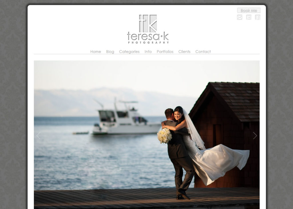
It’s always a thrill to create a new design for a client. Sacramento Wedding Photographer, Teresa Klostermann was no exception. She came to Flaunt Your Site with a few ideas in mind to give her site a makeover. It was close to what she wanted, but it was just lacking a little “curb appeal” so we did what they do on those makeover shows (well we didn’t film me sitting on my butt in front of my computer for a week playing in CSS). Based on the screen shot below I think it was a hit.

Teresa’s site started off with a very snow white WordPress theme that lacked visual depth. It was like a Mondrian painting. White on White. So the first step was to create some three dimensionality and give the site a certain pop. I started with a standard wedding pattern, but created an overlay to darken it. That would isolate the central area of the site and have people’s eyes drawn top the photos in the center.

We ditched her BluDomain site (which I highly recommend to anyone that uses BluDomain), and switched it out to a very iPad loving javascript portfolio. Now if one the 40 million iPad owners happen to be a bride in Sacramento, they’ll be able to look at Teresa’s wedding portfolio without a problem. We also added a few SEO goodies which should help her start to raise up in the ranks.

It was awesome to work with Teresa. She’s got a great passion for photography and it really shows. You should definitely go give her site some love.

Rounded Corners for Photos – CSS Only Trick

03 January

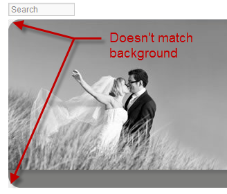
I’ve designed websites for awhile now. And one thing that’s always vexed me is getting rounded corners on JPEGs to look good. In the past I’ve used clipping masks in Photoshop, and having the background color of the Photoshop canvas match the background color of the website. But the JPEG process always shifts the color of the background color and adds artifacts due to the compression process.
As you can see in the example image (taken from a quick design I did for The Unveiled) , the background color in this instance is a very light pale gray, but the triangular area where the image was clipped is a darker shade that clearly stands out.
The other problem comes when you want to change the background color of the site. If it’s visible now, what’s it going to look like when you change the background color to your favorite shade of Fuschia?

Transparent PNGs

Transparent PNGs came along and with the exception of Internet Explorer 6, 7, and 8, gave web designers the beautiful new ability to take graphics and apply different levels of opacity and transparencies.
The best use of this was applying drop shadows to graphics that appeared over multiple elements. Before this, you’d have to combine all elements into one graphic along with the shadow.
This new alpha transparency allowed great flexibility in design including creating shapes and corners that had transparency.

Perfect for what we want right???   Well…

The problem with Transparent PNGs is that they are HUGE. While they work very well for graphics like logos, and design elements that aren’t large file size wise to start, they are terrible for photographs. A 800×600 pixel photo saved as a PNG with alpha transparency is around 800k! Almost a full Megabyte. When the same size file as a JPEG is around 100k, it’s just not practical to save photos as PNGs.

So how does a brother get a decent rounded corner for his photos up in here???

CSS Border Radius to the Rescue!

London Wedding Photographer, Kat Forsyth brought up a question about adding rounded corners to her photos in a photo forum I belong to. I explained to her the options that she had, which equated to the long diatribe above.

But… on a hunch I tried applying the CSS “border-radius” rule to a photo. And it worked!
This as far as I know has never been tried, nor documented.

If you apply this to any image or image class, that image, or the whole image class will take on rounded corners!
border:1px solid #;
-webkit-border-radius: 20px;
-moz-border-radius: 20px;
border-radius: 20px;  

Example

The images below belong to New York Wedding Photographer, Otto Shulze. He graciously let me use a couple images to demonstrate the CSS border radius trick. The image on the left is a standard image. The image on the right ad the highlighted code applied to it using inline CSS (that means I applied to it inside the HTML, not in the CSS file – it just made it easier to demonstrate this).


 How to apply to blog images

The true power in this comes from the ability to apply the same radius to all your photos on your blog posts from one place!  If you want all your photos to have a 15 pixel radius, you only need to change or add one CSS rule, and voila. They’re all changed instantly.

In your CSS file, add this rule somewhere you’ll remember it.

img{border:1px solid #;
-webkit-border-radius: 20px;
-moz-border-radius: 20px;
border-radius: 20px;
}

You can change “20px” to whatever looks good. Just remember to do it on each line as they relate to how different browsers read this rule.

If you use ProPhoto, or some other WordPress template that recommends that you not change the CSS file, they often have an area to add custom CSS. In that case you’ll add the same code in that area.

Another note, is that this rule will apply the rounded edges to all images. You can narrow it down by using “entry .img” or “post .img” or whatever your theme files are specifying for the images inside your blog posts. If you have questions or can’t figure it out, feel free to give us a shout and we’ll help you figure it out.

Find out more

This is just the tip of the iceberg when it comes to using CSS to enhance your photos all at once. You can have multiple radii, making tear-drop effects to your photos, have radii on individual corners and not others, etc. Then there’s things like CSS drop shadows and glows that, when used tastefully, can add something visually appealing to your site and blog posts.

Go check out W3 Schools information on CSS Borders for more on what you can do with these cool tricks.

Oh yeah…

This doesn’t work in Internet Explorer 8 and below, but as I tell everyone, “Internet Explorer can suck it.”